Market Watch
When Markets Become Fragile | What the Absorption Ratio Can Tell Us Before a Crisis

The Absorption Ratio, a gauge of when markets are primed to fall together, and an honest account of what it does not see
In the post “When Everything Falls Together” we showed that diversification has a cruel habit of failing exactly when it is needed. In a selloff, correlations converge, risk assets crash together far more than they rally together, and even gold can be swept up in the dash for cash. That analysis was, by its nature, backward-looking: it described what happens once a crisis is already under way. It leaves the more valuable question unanswered, can the conditions for a crash be seen forming before it arrives? A measure called the Absorption Ratio suggests that sometimes they can. It is just as informative about the times they cannot.
What the Absorption Ratio measures
Borrowed from a 2010 study by Kritzman, Li, Page and Rigobon, the Absorption Ratio asks a deceptively simple question of a broad set of markets: how much of everything that is moving can be explained by just a few common forces? Formally, it is the share of total variance across a group of assets captured by a small number of principal components, statistical “factors” distilled from the way those assets move together. When a handful of common factors explains most of the variation, markets are more tightly coupled and potentially more fragile: a shock affecting those shared drivers can propagate more broadly because a larger share of market behavior is being governed by the same underlying forces. When variance is instead spread across more independent sources, the system is less tightly coupled and potentially more resilient.To measure it cleanly we widen the lens from the multi-asset basket of “When Everything Falls Together” to a homogeneous cross-section (22 major MSCI country equity markets) and track the share of their combined variance absorbed by the top four factors. The result is a single number, running between roughly 0.65 and 0.84 over the past two decades, that captures how unified the world’s stock markets have become at any moment.
Coupling builds before the fall… sometimes
Plotted through time, the Absorption Ratio is anything but stable. It averages 0.76 (the top four factors alone explain about three-quarters of the variance across twenty-two national markets) and it climbs through the great systemic episodes. It rose through 2007 and peaked at 0.835 on 24 October 2008, at the height of the global financial crisis; it reached 0.829 during the 2011 euro crisis and 0.804 in the COVID crash. High readings mark the periods when the world’s equity markets have quietly fused into a single trade, which is exactly when the diversification documented in that post is worth least.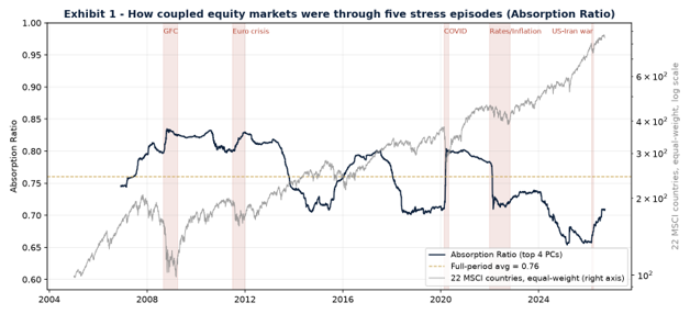
Exhibit 1: Absorption Ratio (top four factors, 22 MSCI country markets) versus global equity (equal-weighted composite of the same 22 MSCI country markets), 2005-2026.
The level is not the signal, the change is
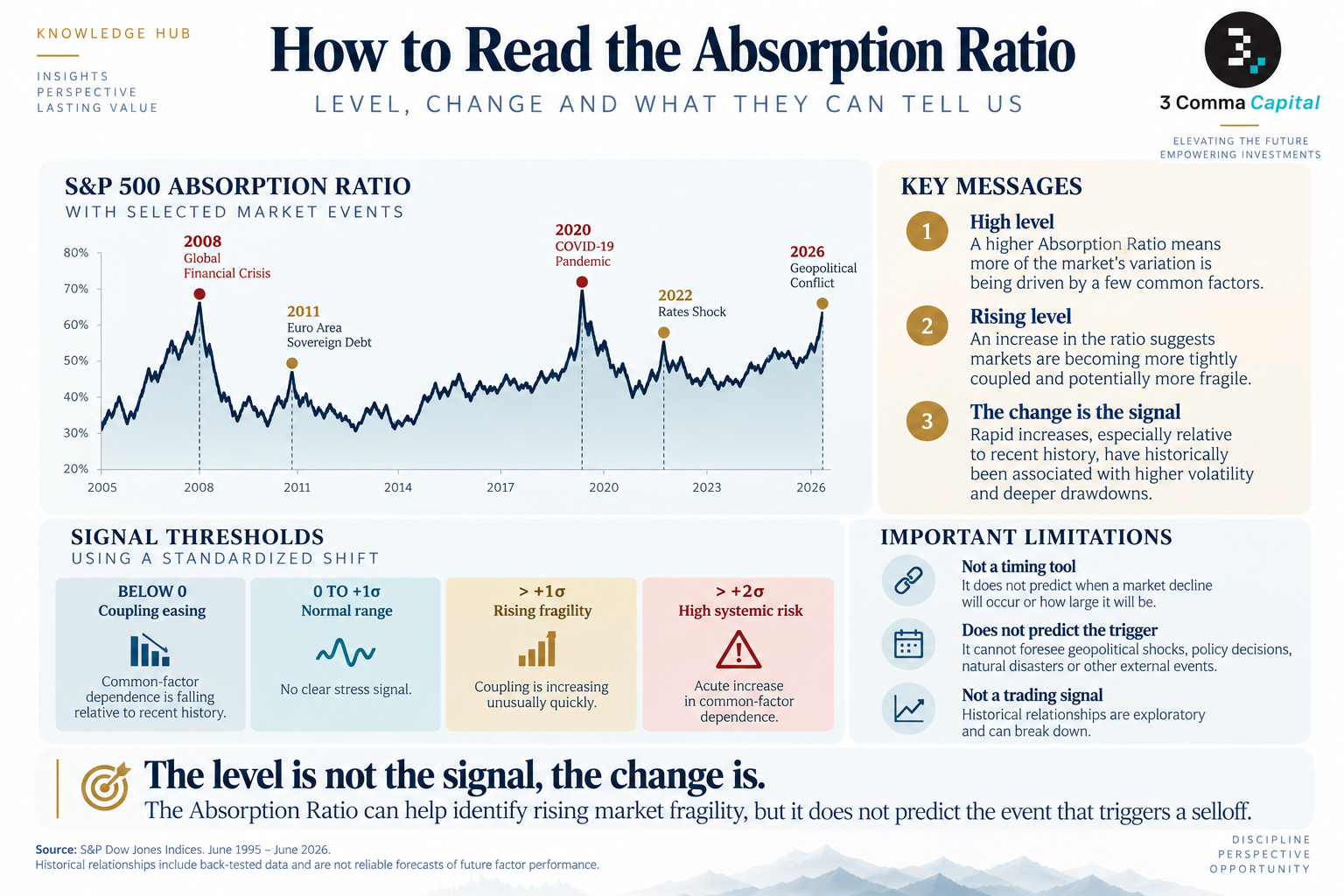
There is a wrinkle. The raw level drifts: markets were structurally more coupled in the crisis-strewn years around 2008-2013 than in the calmer, more idiosyncratic period that followed, so a reading of 0.80 does not mean the same thing in every era. What matters is not the level but the rate of change. Following the original authors, we track a standardized shift (the recent 15-day average of the ratio minus its one-year average, scaled by its own volatility) so that a value above +1 flags the ratio rising unusually fast, and a value below -1 flags it draining away as markets normalize. Two thresholds matter in what follows. Above +1σ the ratio is rising unusually fast, and that is the level the risk test further down uses; above +2σ the rise is acute, and those are the episodes marked on the chart below.The spikes are hard to miss. The signal reached an extreme of +3.8 during the COVID crash of early 2020, +2.8 in the autumn of 2008 and +2.7 in October 2011. Each surge marks a stretch where the market’s factor structure was tightening at an unusual pace: the room filling with gas. Readings above +2σ are the genuinely acute ones. There have been eight since the signal begins in November 2007, and they cluster around exactly the episodes you would expect.
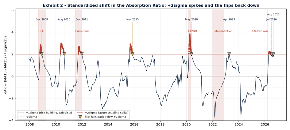
Exhibit 2: Standardized shift in the Absorption Ratio. The dashed line marks +1σ, the threshold behind the risk test in Exhibit 3. The shaded bands mark the acute episodes above +2σ (crisis), and the markers show the flip, the first day the signal falls back below +2σ.
What it caught, and what it missed
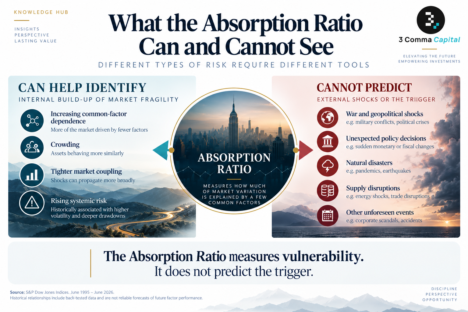
Here the honest account matters more than the flattering one. Across the five major episodes in our sample (crises represented in the shaded area in the graph) the signal crossed +1σ well before two of the episodes and not at all before the other three. It turned up on 20 November 2007, eleven months ahead of the crisis peak, and again on 2 September 2019, more than five months before the pandemic crash. It gave no advance warning of the 2011 euro selloff, the 2022 rates shock, or the March 2026 conflict between Israel, the United States and Iran. In that last case the signal crossed +1σ only on 3 April, after the acute leg of the selloff, and the Absorption Ratio itself was then sitting near the bottom of its historical range, at 0.68.That pattern is not a defect; it is the measure telling you what it is. The Absorption Ratio reads the market’s internal wiring. It sees crisis that build up inside the financial system (leverage, crowding, a slow fusing of everything into one trade) and it is blind to shocks that arrive from outside it. An oil embargo, a central bank changing course, a war: these strike a market that may have been perfectly loosely coupled the day before. The March 2026 episode is the cleanest example in our sample of a large, correlated selloff arriving with no prior build-up in fragility at all.
Does it actually predict risk?
A signal is only useful if it contains information about what follows. In our sample, it does, although in a specific and limited sense. Sorting history by the state of the shift shows that periods following a reading above +1σ were associated with higher realized volatility and deeper average drawdowns than neutral conditions across every horizon we tested, whether in the volatility that materializes and in the depth of the drawdowns that follow. Over the following month, realized volatility averages 15.2% against 12.5% in neutral conditions, and the deepest drawdown averages -4.6% against -3.9%; over the following week the volatility gap is wider still, 14.5% against 10.8%. Sorting instead by the level, periods with the Absorption Ratio in its top quintile go on to suffer three-month drawdowns of -8.1% on average, against -6.6% for the bottom quintile.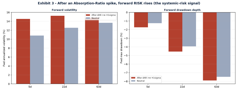
Exhibit 3: Forward volatility and drawdown after an Absorption-Ratio spike versus normal conditions.
This is what we would expect a useful systemic-risk gauge to look like: not a crash timer, but an indicator associated with a measurable shift in the distribution of subsequent risk. Two caveats keep it in proportion. First, the signal is not rare. The shift sits above +1σ on roughly a quarter of all days, so it describes weather rather than sounding an alarm. Second, it does not reliably predict lower average returns. The effect on returns is right-signed at the +1σ threshold but fragile, and it reverses at higher thresholds, because the most extreme readings tend to coincide with crash bottoms, which are followed by rebounds. An investor trading this signal mechanically would have sold several of the best entry points of the past two decades.
And when the pressure comes off
If a rapid rise in coupling marks a market becoming fragile, it is natural to ask what the opposite marks. We tested it rather than assert it. For each of the eight acute episodes we identified the flip (the first day the signal falls back below +2σ, which is observable on the day rather than in hindsight) and measured what global equities did next. Six of those episodes now have a full year behind them: December 2008, August 2010, December 2011, November 2015, May 2020 and April 2023.The year after a flip, the market was up 21.9% on average against 9.9% for a randomly chosen day, and higher in five of the six cases. Over the following month the gap is 5.1% against 0.8%. Taken at face value that looks like a buying signal, and we are going to argue it is not, for three reasons that matter more than the averages.
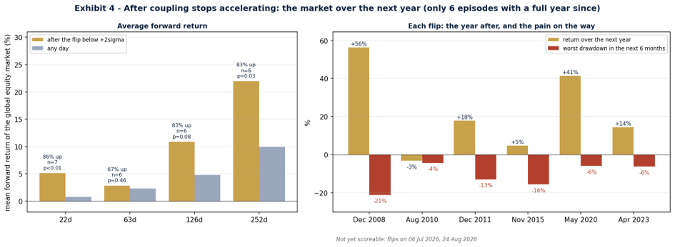
Exhibit 4: After coupling stops accelerating: the market over the following year, and the drawdown on the way there.
First, six episodes is not a sample from which to draw conclusions, and we tested three definitions of a flip across four horizons before settling on this one, which means a single result at p = 0.03 is suggestive, not established. The three-month horizon shows no edge at all. Second, the flip is emphatically not the bottom: after the December 2008, December 2011 and November 2015 flips the market went on to fall a further 21%, 13% and 16% within six months before recovering, and the August 2010 flip was followed by a year of -3%. An investor who read the flip as a green light would have sat through some very uncomfortable months. Third, the signal is live as we write: it fell back below +2σ on July 6th and again on August 24th. That makes it particularly important not to interpret an exploratory historical relationship as a current market call. What the two 2026 readings do say is that coupling is tightening again in a market that had been unusually loosely coupled. Both crossings were shallow, +2.2 in April and +2.0 in August against +3.8 in 2020, so they argue for caution rather than for a call. Two of them in four months could equally mark a signal that is still deepening.
What the flip does say, in language we are comfortable defending, is that coupling has stopped accelerating and the acute phase of an episode is passing. That is genuinely useful, but it answers a different question from the one an investor usually has in mind. It is information about when to add risk back to a portfolio that is already invested, not a reason to have been sitting outside the market waiting for the all-clear.
Not all markets are equal
The same decomposition answers a second, practical question: which markets are the systemic factor, and which march to their own drummer? Ranking each market by how much of its variance the common factors explain (its centrality) produces a clear hierarchy. France, Brazil, China, Germany and Italy sit at the top, with 86% to 93% of their variance explained by the shared factors. These highly central markets have historically exhibited greater exposure to the common forces driving the global equity system. At the other end sit India (43%), South Africa (47%), Australia (50%) and, perhaps surprisingly, Portugal (54%), Canada (55%) and the United States (56%), suggesting a comparatively larger role for market-specific or idiosyncratic drivers over the period analyzed.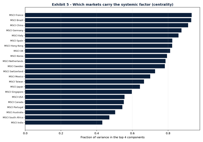
Exhibit 5: Market centrality, the share of each market’s variance explained by the common factors.
For a global equity book, the lesson is concrete: spreading capital across highly central markets may provide less diversification than the position count suggests, because much of their behavior is being driven by the same underlying factors. Markets with lower common-factor exposure may offer a greater degree of independent return behavior, but that does not automatically make them superior diversifiers: volatility, correlations, valuation, liquidity, currency exposure and portfolio context still matter. Position count is not diversification; independence of drivers is.
Our view at 3 Comma Capital
The Absorption Ratio does not forecast the trigger of a crisis. No measure does, and this one is explicitly blind to shocks originating outside the market. It tells you the room is filling with gas, not that someone is about to strike a match, and it says nothing at all about matches struck in the next room. That is still information a risk-aware manager can act on, and it shapes how we run money in four ways.First, as a fragility gauge. When the standardized shift pushes above +1σ, we treat it as a cue to raise the bar for adding risk, tighten our tolerance for drawdown, and place greater emphasis on the diversifying exposures identified in “When Everything Falls Together”, including gold where appropriate, held as a managed position rather than a static hedge.
Second, as a diversification check. Centrality helps us identify where return behavior has historically been less dominated by the common global factors, allowing us to assess whether an equity allocation is genuinely diversifying its underlying drivers rather than quietly duplicating the same exposures under different market names.
Third, as a cue in the other direction. When the signal falls back below +2σ, we read it as the acute phase easing and it lowers the bar for adding risk back, deliberately as a sizing decision inside an invested portfolio and never as a green light that would have justified waiting outside one.
Fourth, as a reminder of its own limits. Because the measure misses externally-driven shocks, and three of the five episodes in our sample were exactly that, it can never be the only thing we watch, and it is never a reason to step out of the market. It gives us additional info about the market and helps us adjust how much risk we carry at the margin. It does not decide whether to be invested.
The bottom line
Crashes feel sudden, and some of them genuinely are. But a class of them are not: long before prices break, markets can draw together into a single, fragile whole, and that fusion is measurable. The Absorption Ratio will never ring a bell at the top, it cannot be expected to provide advance warning of shocks originating outside the market, and it should not be traded mechanically. What it offers is a running read on how coupled, and therefore how fragile, the market has become, which turns the vague feeling that “this looks risky” into something you can put a number on, and weigh, before rather than after the fall.A note on method
The Absorption Ratio is computed from daily total returns of 22 MSCI country equity indices, January 2005 to September 2026, as the share of total variance captured by the top four principal components (about one-fifth of the cross-section, following Kritzman, Li, Page and Rigobon, 2010) of a 500-day rolling covariance matrix. The standardized shift is the 15-day moving average of the ratio minus its 252-day average, divided by the 252-day standard deviation. “After a spike” compares the 5-, 22- and 63-day forward volatility and maximum drawdown of an equal-weighted global equity index following days when the shift exceeded +1σ, against all other days. Centrality is each market’s share of variance explained by the top four components. Acute episodes are stretches with the standardized shift at or above +2σ, merged when they fall within 21 trading days of one another; the flip is the first day the shift closes back below +2σ, using only data available on that day. Forward returns after a flip are compared with the unconditional distribution of forward returns over the same horizon, with the reported p-value the share of randomly drawn date sets of equal size performing at least as well. Eight episodes have occurred since the signal begins in November 2007 and six have a full year of subsequent data; three flip definitions and four horizons were examined, so these results are treated as exploratory.
 |
Portfolio Manager
|
Miguel has a bachelor's degree in Economics from Universidade Católica and is polishing his quantitative and modeling skills at ISEG. Miguel is helping to develop the analysis framework for our liquid funds and managing the Portuguese equity sleeve for PGI.
More about Miguel Cortês


