Market Watch
When Everything Falls Together

Key Takeaways
- Diversification works most of the time - but correlations tend to spike during periods of market stress, reducing its effectiveness when investors need it most.
- Risk assets increasingly move together during crises, as forced selling, liquidity shortages and market-wide risk aversion overwhelm individual asset fundamentals.
- The downside correlation between equities and high-yield credit, subordinated debt and other risk assets is significantly stronger than the upside correlation, making portfolio losses more synchronized during sell-offs.
- Gold has historically been one of the most effective portfolio diversifiers, while government bonds have become less reliable hedges in an inflation-driven environment since 2022.
- Even traditional safe havens can temporarily fail during severe liquidity events, as demonstrated by the March 2026 'dash for cash,' when gold, bonds and equities declined simultaneously.
- Successful diversification is not about owning more assets, but about combining investments with genuinely different economic drivers and continuously monitoring how correlations evolve through different market regimes.
- At 3 Comma Capital, portfolio construction focuses on active diversification, stress testing and dynamic risk management, recognising that market relationships change precisely when portfolio resilience matters most.
Diversification is often called the only free lunch in finance. Spread your capital across enough genuinely different assets, the theory goes, and their ups and downs partly cancel out, leaving a smoother ride for the same expected return. It is sound advice, most of the time. But it carries a piece of fine print that investors rediscover, painfully, in every crisis: correlations are not constant. The diversification you are counting on has a habit of evaporating at the precise moment you need it most.
This is not a matter of opinion, so we measured it. Using more than two decades of daily data, from 2005 through mid-2026, across a basket that mirrors the building blocks of our own funds (global and Portuguese equities, investment-grade bonds, high-yield and subordinated credit, emerging-market debt, core government bonds, gold, silver and bitcoin), we asked a simple question: how does the relationship between assets change when markets fall apart?
Correlation Spikes in Every Selloff
The first chart tracks the average correlation between every pair of assets in the basket, measured over a three-month rolling window. If diversification were stable, this line would be roughly flat. It is not. It lives around an average of 0.21 in normal times, then lurches upward in every episode of market stress, the global financial crisis, the euro crisis, the COVID crash and the 2022 inflation shock are all visible as spikes. At the depth of the COVID selloff in March 2020, it reached 0.62, nearly triple its calm-market level. The pattern runs right up to the present: when conflict between Israel, the United States and Iran erupted in March 2026, sending oil sharply higher and government bonds lower, average correlation climbed again, reaching 0.55 by late May, its highest level since the 2020 pandemic crash.
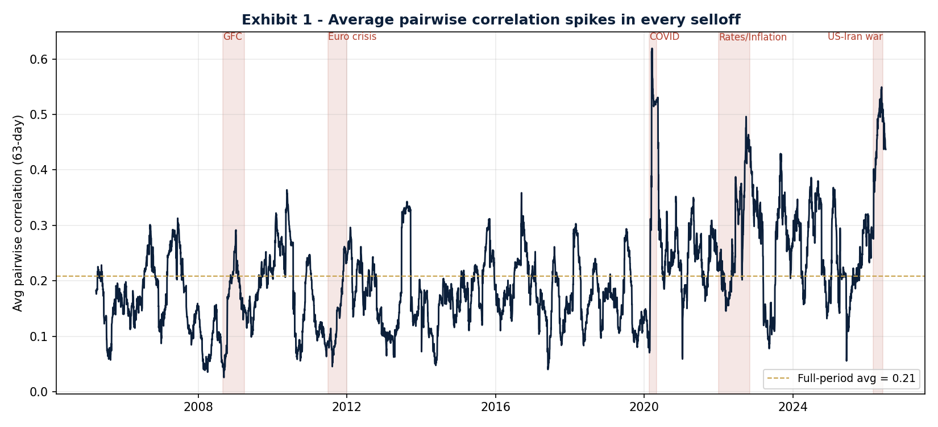
Exhibit 1, Average pairwise correlation across the basket, 2005–2026. Stress episodes shaded.
Putting numbers on those spikes makes the point sharper. The chart below measures the average correlation within each major stress episode and sets it against the calm-market baseline. Every crisis sits well above normal, but the two most extreme are the COVID crash and, strikingly, the March 2026 US–Iran conflict, where the risk sleeve’s average correlation reached 0.51, second only to the pandemic and comfortably above both the 2008 crisis and the 2022 selloff. It is also the episode in which diversification helped least: the all-asset and risk-only averages nearly converge, because the classic diversifiers, government bonds and even gold, stopped decoupling and fell alongside the market. That episode deserves a closer look, because it exposes the limits of any hedge.
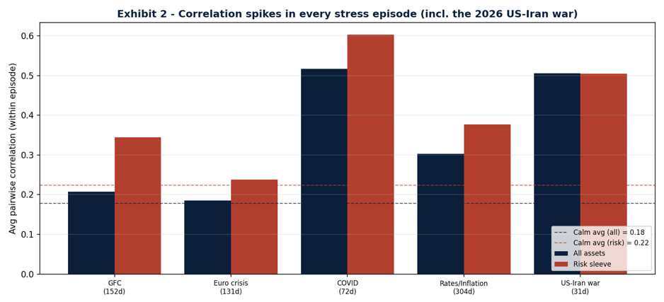
Exhibit 2, Average correlation within each stress episode, all assets versus the risk sleeve, against the calm-market baseline.
When the Market Breaks, Everything Moves as One
Averages over time only hint at the problem. To see it cleanly, we split every trading day into two buckets, the calmest 90% of days, and the worst 10% of days for equities, and computed the correlation matrix within each. The contrast is stark. Among the risk assets in the basket, the average correlation rises from 0.22 on normal days to 0.40 on the worst days, an 81% jump. In the heatmap below, the risk-asset block turns from pale orange to deep red exactly when an investor is relying on those holdings to behave differently from one another.
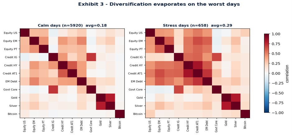
Exhibit 3, Correlation matrix on calm days (left) versus the worst 10% of equity days (right).
Why does this happen? The mechanics are mostly behavioral and structural rather than fundamental. In a selloff, investors sell what they can, not what they want to. Margin calls, fund redemptions and forced deleveraging push people to raise cash from every corner of the portfolio at once; liquidity thins out; and a single, market-wide risk-off impulse swamps the individual stories that normally keep assets apart. In the language of portfolio theory, the systematic component of risk, the part you cannot diversify away, takes over from the idiosyncratic differences that make diversification work on an ordinary day.
Assets Crash Together More Than They Rally Together
There is a subtler and more troubling pattern hiding inside the averages. A standard correlation figure describes the average, two-sided relationship between assets. It says nothing about whether that relationship is symmetric, and it usually is not. We measured the correlation of each asset with equities conditional on both crashing together, and separately conditional on both rallying together. For most risk assets, the downside relationship is far stronger than the upside one.
| Asset | Falling together | Rising together |
|---|---|---|
| High-yield credit | 0.54 | 0.19 |
| Subordinated Bank Debt (AT1) | 0.59 | 0.34 |
| Investment-grade credit | 0.46 | 0.24 |
| Emerging-market equity | 0.54 | 0.48 |
| Gold | 0.25 | 0.42 |
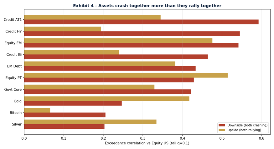
Exhibit 4, Correlation with equities when both are crashing (red) versus both rallying (gold).
High-yield and subordinated bank debt are the clearest cases: they fall in lockstep with equities but participate only weakly in the recoveries. Anyone who lived through the wipeout of Credit Suisse’s AT1 bonds in 2023 has seen this asymmetry in its rawest form. The lesson is that correlation is a fair-weather friend, it tells you how assets behave on an average day, not how they behave on the worst day, which is the only day that really tests a portfolio. Gold, notably, shows the opposite signature: it is less correlated with equities when they fall than when they rise, which is precisely the behaviour you want from a hedge.
What Actually Diversifies, and When the Hedge Breaks
If broad diversification thins out in a crisis, what is left? Genuine protection comes not from owning more line items but from owning assets with genuinely different drivers, and surprisingly few clear them. Our data points to two conclusions, one reassuring and one cautionary.
| Correlation with Equities | Normal Markets | Market Stress |
|---|---|---|
| Gold | +0.07 | −0.02 |
| Government bonds | 0.00 | −0.06 |
| Silver | +0.15 | +0.16 |
Gold is the most reliable of the three: across the full history its correlation with equities is already low and edges into negative territory when markets are under stress, on average it holds its ground, or gains, while everything else is being sold. But “on average” conceals an important exception, which we come to shortly. Silver, despite its precious-metal label, does not diversify; it stays positively correlated with risk assets throughout, behaving more like an industrial commodity than a safe haven. Government bonds are the cautionary tale. Over the full history they look like a dependable hedge, but that average conceals a regime change.
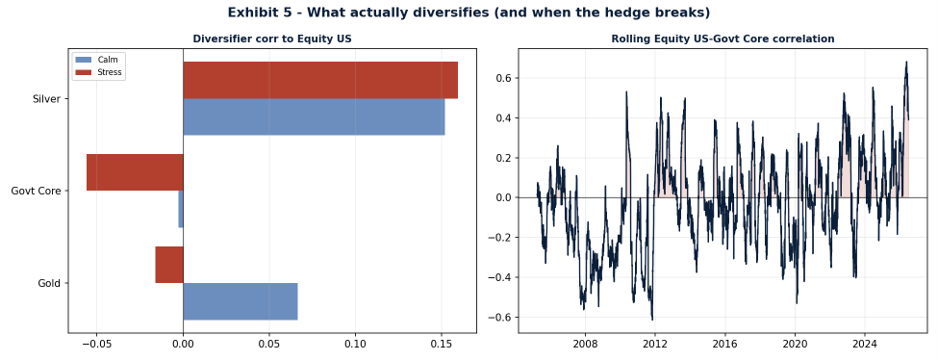
Exhibit 5, Left: diversifier correlation with equities, calm versus stress. Right: the rolling equity–bond correlation and its breakdown.
The right-hand panel tells the story. Through the 2008 and 2011 crises, the equity–bond correlation was deeply negative, around −0.34 in 2008, so government bonds rallied as equities fell and cushioned the blow. Since 2022, that relationship has flipped: as inflation and rising rates drove both stocks and bonds down together, the correlation turned positive, climbing toward +0.40 by 2026. Bonds hedge equity-led crises but fail in inflation-led ones. The classic 60/40 portfolio learned this the hard way in 2022, and the 2026 oil shock delivered the same lesson in miniature, an inflationary, supply-driven jolt that sent equities and government bonds down together. Gold’s record across these episodes is better, but as the next section shows, even gold has a breaking point.
Even Gold has a Breaking Point: the March 2026 Dash for Cash
The 2026 US–Iran war is worth pausing on, because it tests the gold thesis at its weakest point. Over the full March-to-June window gold fell 20% and silver 24%, but those numbers flatter to deceive. The window opens at gold’s all-time high, reached after a 22% safe-haven rally into the conflict, and it closes after equities had staged a full, V-shaped recovery. The cleaner test is the acute sell-off itself, the first month, when equities actually fell.
In that acute leg everything fell together, and the supposed safe havens fell hardest of all:
| Total Return | Acute sell-off (1–31 Mar) |
Full war window (Mar–Jun) |
|---|---|---|
| Equities (US) | −5.0% | +8.2% |
| Emerging-markets Equities | −11.7% | +13.4% |
| Gold | −12.3% | −20.0% |
| Silver | −15.9% | −24.0% |
| Government bonds | −2.3% | −0.8% |
Gold dropped more than twice as much as equities, and its correlation with the falling market ran to +0.44, nowhere near the negative reading a hedge is supposed to provide. Government bonds and silver offered no shelter either. This is the signature of a liquidation-driven “dash for cash”: when investors must raise money in a hurry, they sell whatever has a bid, and in the first, most violent phase of a shock even gold becomes collateral damage. It happened in March 2020 too, when gold fell around 12% in the initial scramble before reasserting its haven role and going on to new highs.
None of this dethrones gold. Across sustained crises, the drawn-out bear markets that do the real damage, it remains the most dependable diversifier in our data, which is why it earns a place in both funds. But 2026 is a useful corrective to a lazy assumption: gold is a good hedge, not a perfect one, and it is least reliable in exactly the fast, liquidity-driven episodes that frighten investors most. An asset that can round-trip 22% up and 20% down in six months is not something to buy once and forget. It is a position to be monitored, sized, and, once a safe-haven spike has run its course, trimmed. That is the difference between owning a hedge and managing one.
How We Build for This at 3 Comma Capital
None of this means a portfolio can be made crash-proof, systematic risk is, by definition, the risk you cannot diversify away. But it can be made crash-aware, and that distinction sits at the center of how we run money. Three principles follow directly from the data above.
- First, we diversify by driver, not by count. Our Atlantic Bond Fund spreads exposure across more than 2,000 issuers, but breadth alone is not the point, a thousand bonds that all sell off together are one position wearing a disguise. Both the Atlantic Bond Fund and the Portugal Golden Income Fund carry a deliberate allocation to gold precisely because it is one of the few assets that has held its independence when correlations elsewhere converge on one, and, as March 2026 showed, precisely because even gold must be actively monitored and sized, not treated as set-and-forget insurance.
- Second, we treat the classic hedges with appropriate suspicion. The 2022 breakdown in the stock–bond relationship is exactly the kind of regime shift that a static, backward-looking view of diversification misses. We monitor how correlations behave in stress, not just on average, and we do not assume that what hedged the last crisis will hedge the next one.
- Third, we measure tail risk explicitly. Rather than trusting a single correlation number, we stress-test how the portfolio behaves when assets move together at the extremes, and we size positions with that joint-crash behaviour in mind. It is a more demanding way to build a portfolio, but it is the honest one, and it is reflected in the conservative risk profiles of both funds, rated 2 and 3 out of 7 respectively on the regulatory scale.
► The Bottom Line
Diversification remains the closest thing investors have to a free lunch, but the menu changes in a crisis. On the worst days, ordinary correlations climb, risk assets crash together far more readily than they rally together, and the hedges everyone assumes will help may quietly stop helping.
The investors who come through such episodes intact are not the ones who owned the most positions, but the ones who understood which of those positions would still be pulling in a different direction when it mattered. That understanding, not the headline number of holdings, is what diversification is really for.
A note on method
 |
Portfolio Manager
|


